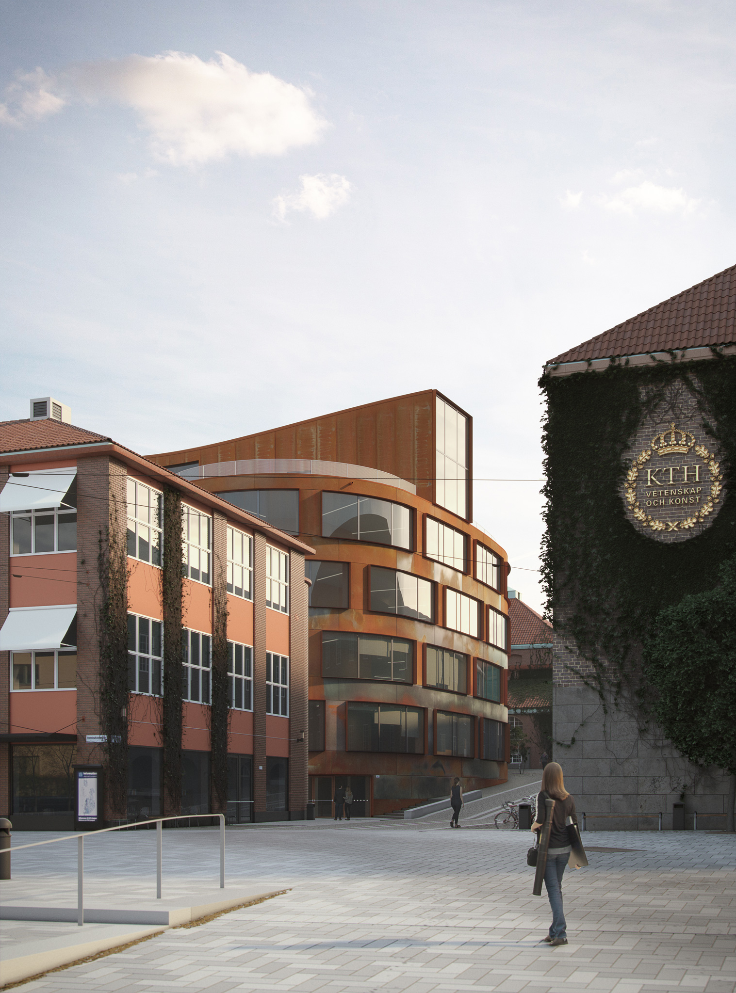
I completed this image a couple of months ago, in January of 2018. It was a challenge hosted by Ronen Bekerman’s blog. The base 3D model was provided by Tomorrow. It was the participants’ task to find the best framing, concept, and materials. Here I’ll break down some of my process.
Breakdown: Lighting
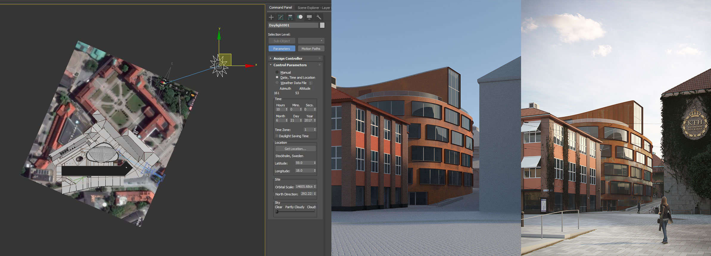
Since one of the only directions given was that the image should be natural and realistic (a point that I’ll come back to often), I thought it would be a good idea to start by studying the possible positions of the sun. To do that I used a satellite image from Google Maps as reference to find out where the building was pointed to, and then proceeded to use Max’s sun system to find out the position of the sun. I decided that the angle of the sun at 9 in the morning during summer would light and highlight the main building in an interesting way. Also, by positioning the camera close to the angle of incidence of the sun we would be able to see the more reflective parts of the corten steel that haven’t “rusted” out completely yet.
The final render had a V-Ray sun with an HDRI in a dome light. The V-Ray sun was set to a 5 size multiplier to simulate the light of the sun going through the early morning clouds/mist, effectively making the sun’s shadows softer. The HDRI was later added to give that “GI” feel. The sun in the HDRI was positioned in the same general direction as the V-Ray Sun. VRayEnvironmentFog was also used.
Breakdown 2: Composition
Like I mentioned in my original concept post, my goal was to show the new architecture school building in its context, so it would be necessary to show some of the other existing KTH buildings. I chose the camera position to be in a place where, even thought most of the image is not showing the main building, everything in the composition is pointing to it, forcing the viewer’s eyes and attention always to fall where it should be.
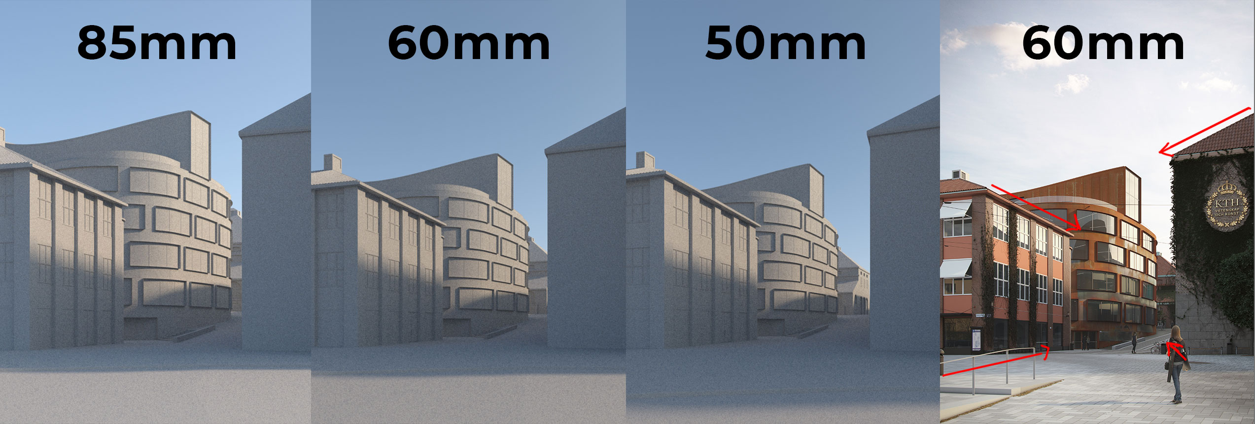
In the beginning I was thinking about placing the camera far away and using a lens like 85mm (on a full-frame camera) in order to compress the space between the buildings so the arch school building would look bigger in relation to the other buildings, even being farther back. As I was working on it though, I felt that at 85mm the image was looking flat and lacking dimension. Plus, a narrow FOV like 85mm is not very common in architectural photography, so a view this narrow wouldn’t help make the image look photoreal. At 50mm the vanishing/perspective lines started getting a little too extreme for me, so I decided to settle on 60mm.
Breakdown 3: Ground
Alright, so let’s start breaking down specific parts of the image.
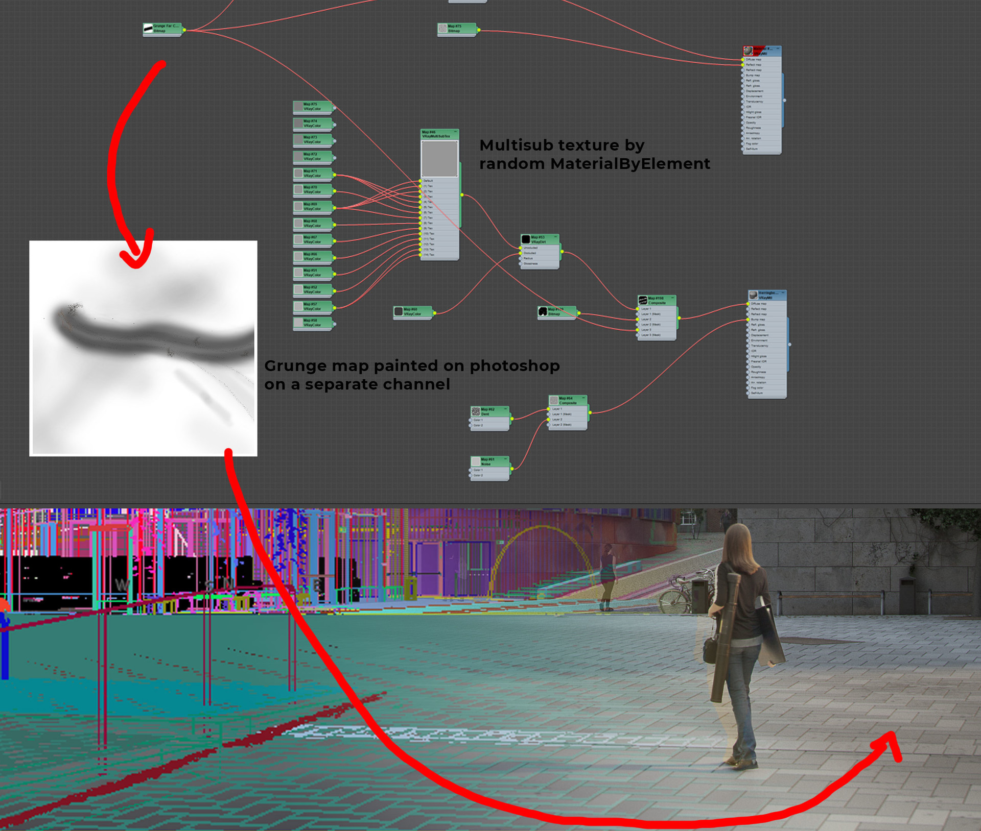
There’s no secret to how I did the ground, really. The herringbone pattern was done in geometry and then all the individual blocks were attached together into a single object. I used the modifier MaterialByElement to randomize each of the blocks’ IDs and used VRayMultiSubTex to vary the colors between them. I also added VRayDirt to the ground material to get some dirt in the cracks. Max’s procedural map “dent” was used in the bump slot to add some variation to the concrete. I feel that’s the appropriate amount of detail I needed since that part of the image would be a little out of focus due to the camera being focused on the building.
I also painted and added a map on a separate channel to simulate the wear of tires and cars. I created a brush in photoshop that would simulate the oil leakage of cars over time.
The ground near the arch school was also worked on. I ended up making it way more detailed than I needed given the camera angle and distance.
Breakdown 4: Environment
The surrounding buildings have fairly simple materials. Just good textures with VRayDisplacement mod. I modeled some details around both buildings and had to modify the original model based on current photos of the place, but not by much. All the props were modeled by me except for the bikes and trees.
The roof tiles were modeled according to reference, and by golly, was it hard to find reference that was high-res enough that would show how the tiles are shaped. The randomness in color was done in the same way as the ground described in my previous post.
The Ivy was created with Guruware’s free Ivy Generator. I was thinking about getting either GrowFX or Speedtree just to model the ivy, but both were outside of my budget. Ivy Generator did the job just fine. I had to use VRay proxies and create vrmeshes out of them so my computer wouldn’t get bogged down every time the ivy was visible in the viewport. The material for the Ivy was created by me, and if you’re impressed by tangled nodes, you’ll be impressed with the screenshot from my slate material editor
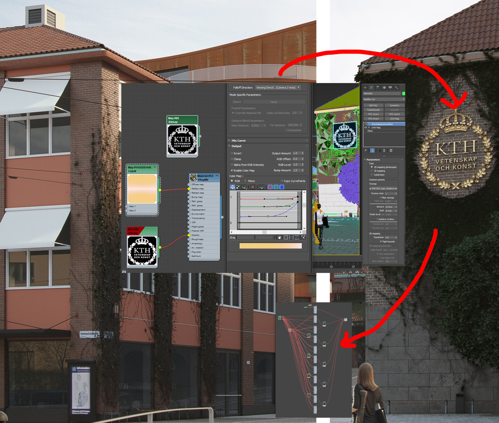
The gold KTH logo is a flat plane with VRayDisplacement mod. I created the displacement map from the original logo. The gold material uses that technique shown in Grant Warwick’s course, the one were you mess with each color’s separate Fresnel curve through the output tab of a falloff map.
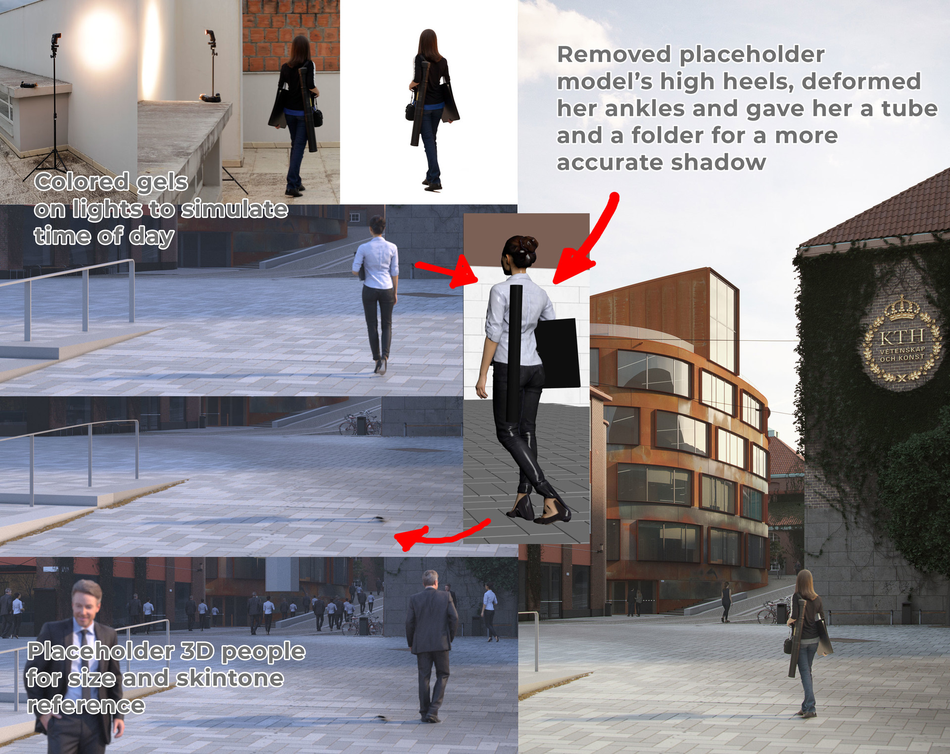
Breakdown 5: People
My idea was to insert a person with typical architecture student items to help the viewer instantly understand that the proposed building has something to do with architecture. That, coupled with the surrounding buildings, now any viewer from Stockholm should instantly understand that this is a building for the architecture school without it having to be explained to them verbally. The narrative should be self-evident by now. It’s about a young architecture student going to school, earlier than most of everyone, to finish her project. Projects in architecture school are notorious for taking a long time to finish, so it’s common for students to pull all-nighters or come earlier to class to finish projects.
To make that idea work I set up a makeshift “studio” and asked my girlfriend to borrow her mom’s architectural things from her time as a student. Luckily it was overcast while we were shooting, otherwise I would have had to do the photoshoot inside. I added colored gels to the lights in the same direction as the sun to simulate the light from the early morning. The lights served just as an additional highlight, with the ambient light from the overcast day doing most of the lighting.
In order to blend in the photo I shot of my girlfriend as an arch student, I took a free 3D model from Renderpeople and used it as a placeholder to cast the correct shadow. I edited the model so there were no high heels and to include both the folder and the tube props.
I added other people farther in the image so the viewer will get a better sense of scale. For those, I rendered a pass of 3D people to use just for size and light/skin tone reference.
Breakdown 6 : The Architecture School Building
Finally, we get to the most important part of the image.
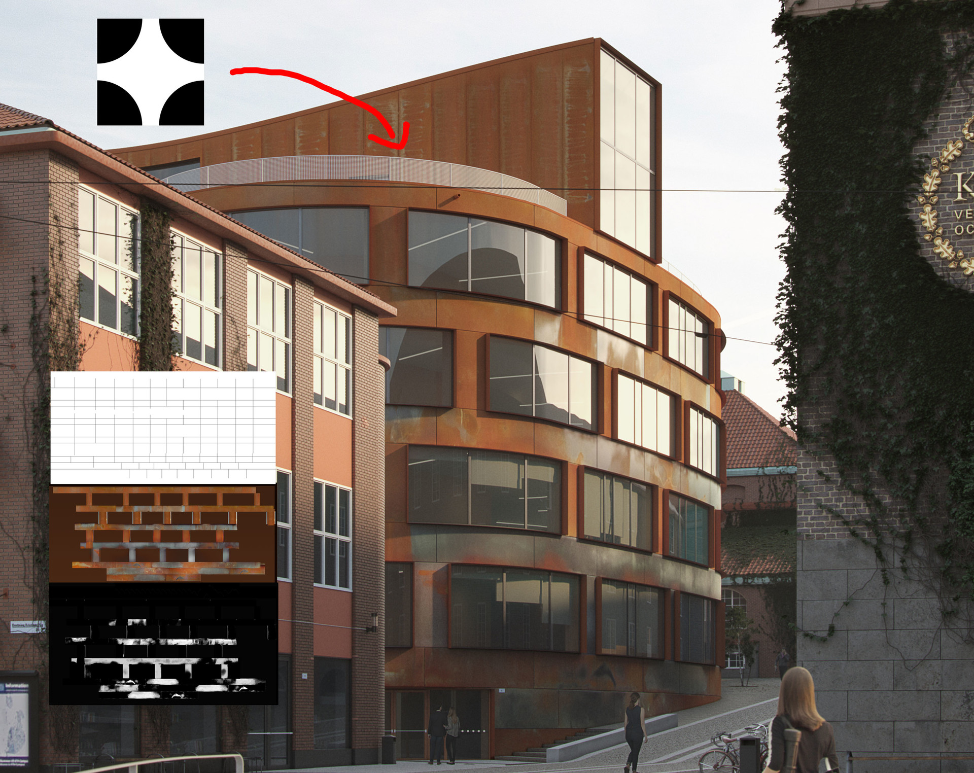
As you can probably tell already, the corten material is quite a challenging one. I had to do some reading on corten and look at some reference images. What I found out was that the steel actually comes “unweathered” or “unrusted” and it gets that rust look over time by exposure to the elements. So what we see in the ArchDaily reference photos are parts of the building weathering and aging at different stages due to each panel’s different exposure to the sun and rain. I thought the best way to show that the purple-ish and greyish parts of the panel were actually “unweathered” was to show that those parts were more reflective than their weathered counterparts.
In my earlier attempts I tried to come up with a procedural process that would emulate this weathering pattern, but to no avail. After what it felt like hitting my head against the wall for a couple of days I realized: there’s no other way, I have to unwrap the UVW. It wasn’t a big deal, as I had already unwrapped the building to create the joint between the panels as displacement. And after just one afternoon creating the diffuse and reflection UVs in photoshop I realized that I should have decided to do that way earlier. Lesson learned for me.
In a better reference photo I saw that the guardrail on the roof is actually made up of perforated panels, not glass. So I “unshelled” the existing glass model and applied a simple opacity map to the rail’s planes.
Final thoughts – What Would I have done Differently
This challenge was a huge learning experience for me. There are a lot of firsts in this image for me. Having no client breathing down my neck allowed me to experiment, but it also meant that it made me take longer to get the image done. That’s something that I would do differently if I were to redo the project: I would have given myself a bit of a stricter timeline. One of the main problems I faced in the beginning was the fact that I got bogged down on the corten material for the two first days. After getting bogged down for a while, I decided to work on the project as I would if I were constantly showing it to a client for progress updates. Instead of starting from the details, I tried to finish the scene overall little by little. By the time I was almost done and it was time for me to get back to the corten I was refreshed and I knew exactly what I needed to do to get it done.